Signed in as:
filler@godaddy.com
Signed in as:
filler@godaddy.com

The Face is usually one of the first things that an Artist may draw.
It is the one thing that we all have and interact with throughout our lives. It is constantly changing over time and it is the "cover of the book" to who we are as human beings. Expressions can translate across time and cultures, transfix us to wonder what was the cause behind the expression. It can connect us to others different than us through empathy for that person or people.
"The eyes are the windows to the soul" as the old saying goes, is true.
The variations of colors, sizes and shapes lend for a wide range of interesting looks. Some eyes are lively some are not, but each pair of eyes has a story to tell behind them.
Comic books were a big influence in the early days how I would draw my faces and people.
The head and the eyes were the first things that I started with. I was always frustrated that I couldn't draw a face in the realistic style like my good friend Colin Miller. I saw how positively people responded to drawings of themselves and loved ones. You were considered a "real Artist" to some if you were able to do that back then.
Abstraction was nice, but that's strictly relying on an emotional connection to shapes, colors and composition rather than have a recognizable subject to connect with. I've always had an admiration for Artists that could draw or paint a face in an abstract manner and make it look realistic at the same time. In my 20's and hanging out in NYC bars, I would start to sketch the people around me but never to full completion except for a few occasions..
These rough sketches are more dreamlike notations than documenting a scene in a realistic manner. Around 1998 instead of going for a hyper realism style, I decided to combine graphic design techniques of composition, high contrast and logo creation to simplify and highlight the most important features of the face and head; the eyes, the mouth and the hair. I prefer the starkness of mostly black and white high contrast to add weight and emotional context to the lines.
Why do I draw mostly female heads and faces? Because they have way more interesting items on them! They have a larger variety of ever changing hairstyles, accessories, clothes and makeup. They are their own walking canvases.
Art Nouveau was also a big inspiration for this as well. Artists such as Alphonse Mucha, Gustav Klimt and Henri de Toulouse-Lautrec are my favorite Artists of that genre. The flowing hair, the symbolism, the expressions, the patterns all helped to play a role in how I would develop my drawing style over the years..
I mostly start my drawings in pencil then will complete it in ink or with an application such as Adobe Illustrator. A few have been created with a pen or a marker pen combination. Paper is usually standard 8.5"x11" 20lbs. copy paper or 65lbs. 8.5"x11" cardstock paper, 12"x18" 50lbs fadeless art paper, 16"x20" canvas paper pads, 24"x36" poster boards, Kinko's 8.5"x11" Astrobright paper sheets.
Portraits
Narrative of a Scene
Object of Desire
Celestial Entity
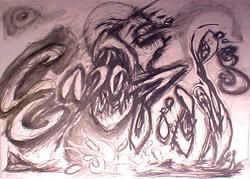
Demonic Entity
Cosmic Entity

This is where EVERYTHING starts for me...the rough sketch. The tip of my pencil or pen swirling around in light scribbling movements until either a head, an eye or the outline of a figure starts to form on the page.
Notebooks, drawing pads, napkins, coasters, anything with a firm surface to take the pressure of the pen or pencil as the image unfolds before me.
I tend to start in the center of the page. It's like stepping into a large, blank space that is endless, then seeing a small dot and walking then running towards that dot and as you do that dot becomes a line then a series of lines leading up to a forest of lines and scribbles.
You cut through the forest of lines and scribbles like a lumberjack and like a carpenter, assemble these into a structured thought, an image.
My former Art Professor Jerry Bellas, remarked how my sketches reminded him of the Artist Alberto Giacometti. I took that as a compliment. To me, sketching is the direct translation of inspiration from the inner mind. Sketching is the first thing I did and it will probably be the last thing I do. We'll see...
Pencil
Pen
Ink
Marker
Charcoal Sticks
Pastel Sticks
Started off as a small sketch of a woman in movement, experimenting with the one pose to slightly alter the position of the left arm in movement like an old animation cell. As the woman is on her journey, she encounters a mysterious man and is transformed through their union. She is able to take these experiences both positive and negative to help her continuing journey through life after she has left him.
The first sketch was used as a flyer for a documentary made by my friend
Dr. Amy Champ in 1997.
Copyright © 2026 drewkidd / Andrew W. Kidd III - All Rights Reserved.