Signed in as:
filler@godaddy.com
Signed in as:
filler@godaddy.com

Starting in 2003, I enrolled at MSJU to pursue a BFA degree in Graphic Design/Fine Art with a minor in Internet Design, basically 3 different concentrations at once. I had classes taught by many wonderful Professors such as Beth Brann, Michael Kroeger, Jerry Bellas, Dr. Bollen, Loyola Walters and others providing me with additional creative guidance in Fine Art Graphic Design, Digital design, Art History, Color Theory, Typography, Photography, Painting, Sculpting and more.
My previous credits from the ACA years did not transfer over to MSJU, so I had to start from scratch as a freshman again. I met a whole new class of younger, new students most straight out of high school, a few in their 20’s.
Color theory, Art history, Typography, Graphic Design, Illustration, Painting were a part of my curriculum. I along with my classmate Tom Hennessy, we formed the 1st ever Philosophy club on campus. Tom was the President and I was the Vice President for 2 years and our professor Dr. Michael Sontag, was the moderator for our weekly discussions and events. Our topics included cloning, color affects on the human emotions and more.
The flyers I made for our discussions used the title PsychoEthicalHumans which is a word mashup of my previous courses Psychology, Ethics and the Humanities.
My entry for the poster contest didn’t win, but my card design for the 8 of clubs was selected for the MSJ custom deck of cards that was sold on campus for charity.
With Photography being one of my interests, I took all the photo courses taught by John Griffith and joined the MSJ/SPS (Student Photography Club). Working with Meche’ Ragland of Media Bridges, I was able to co-ordinate the 1st off campus photo exhibition. I also facilitated a few guest speakers such as Artists, Velma J. Morris, and Brian Cottingham, a fellow ACA alumni who had his own design business at the time.
At Earth Connection volunteering with several other ladies coordinated by Sis. Winnie, we built 6 wooden garden beds over the summer of 2015. The vegetables that we picked on a weekly basis were donated to a local food pantry and distributed throughout the community.
Lions-on-Line was a poetry based publication on campus that came out quarterly. The very last statement I made there sums it up in the serenity of my photo that was used for their Fall 2015 issue.
I really enjoyed my years there, all of the people that I met and all of the things that I accommplished.
Thank you MSJU, I miss you!
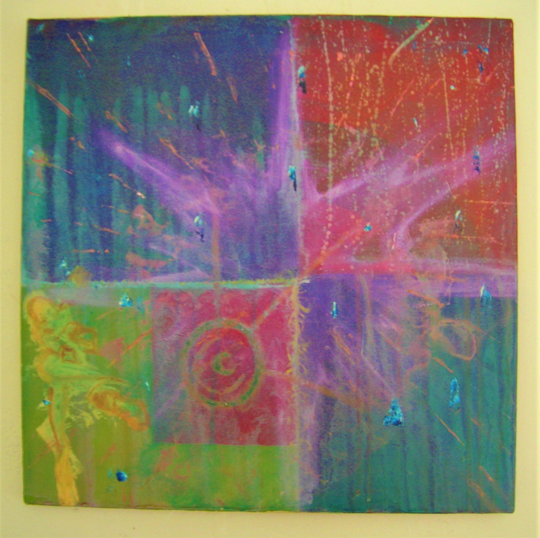
I joined the Art Students League late 1993. I was looking for an educational setting where I could meet and network with other Artists and enhance my Abstract Painting skills. I only participated in one course and left in 1994 to attend a private painting group run by the instructor.
The Instructor John, introduced me to a new brand of acrylic paints called Golden and it's textured mediums, glosses and gels. The first painting “Starburst” I made there is a multi-colored canvas with a yellow Bruce Lee like figure in the corner doing a sidekick.
This experience directly influenced my painting and my decision to primarily use Acrylic and I painted as much as possible so that I could start to show my paintings in public.
I met Cyndi Mendell while she was visiting our high school shortly before I graduated. I had second thoughts about pursuing Drafting as a profession, thinking it was colorless and boring. I had just finished the High School yearbook with a suggestion by the printer to go into Graphic Design.
After several unsuccessful attempts to gain entry into UC’s DAAP (due to an overall low “C” GPA), I picked up the brochure from ACA and applied… After a few weeks I was accepted and on to college.
Marion Allman was the founder and President. ACA was a 2 year intensive training program of a series of classes with two groups of students with about 20-24 students in each group in a small one level building that was across from the Walnut Hills Library (before it was struck twice by lightning) 00
This is where I learned the fundamentals of Desktop Publishing, Typography, Printing Techniques, Illustration Techniques, Conceptualizing and Describing Designs.
I started working with the 1st wave Adobe Photoshop, that used a small overhead square store camera as the scanner. It was not like our current scanners of today. It was more akin to early photography where you had to sit still as a statue until the inner lens scanned across your face. The scan of Mike demonstrates this effect. The photo with myself, Don Betts and Steve DiLeonardo is the 1st scanned photo I appeared in.
By surprise, I had reunited with Colin Miller there, whom I hadn’t seen since I’d left Princeton High in 1985 and switched to Woodward High. We started our painting collaborations on large drawing boards. We even at one point for fun, had our entire class create a series of panels that connected edge to edge and was displayed around the classroom.
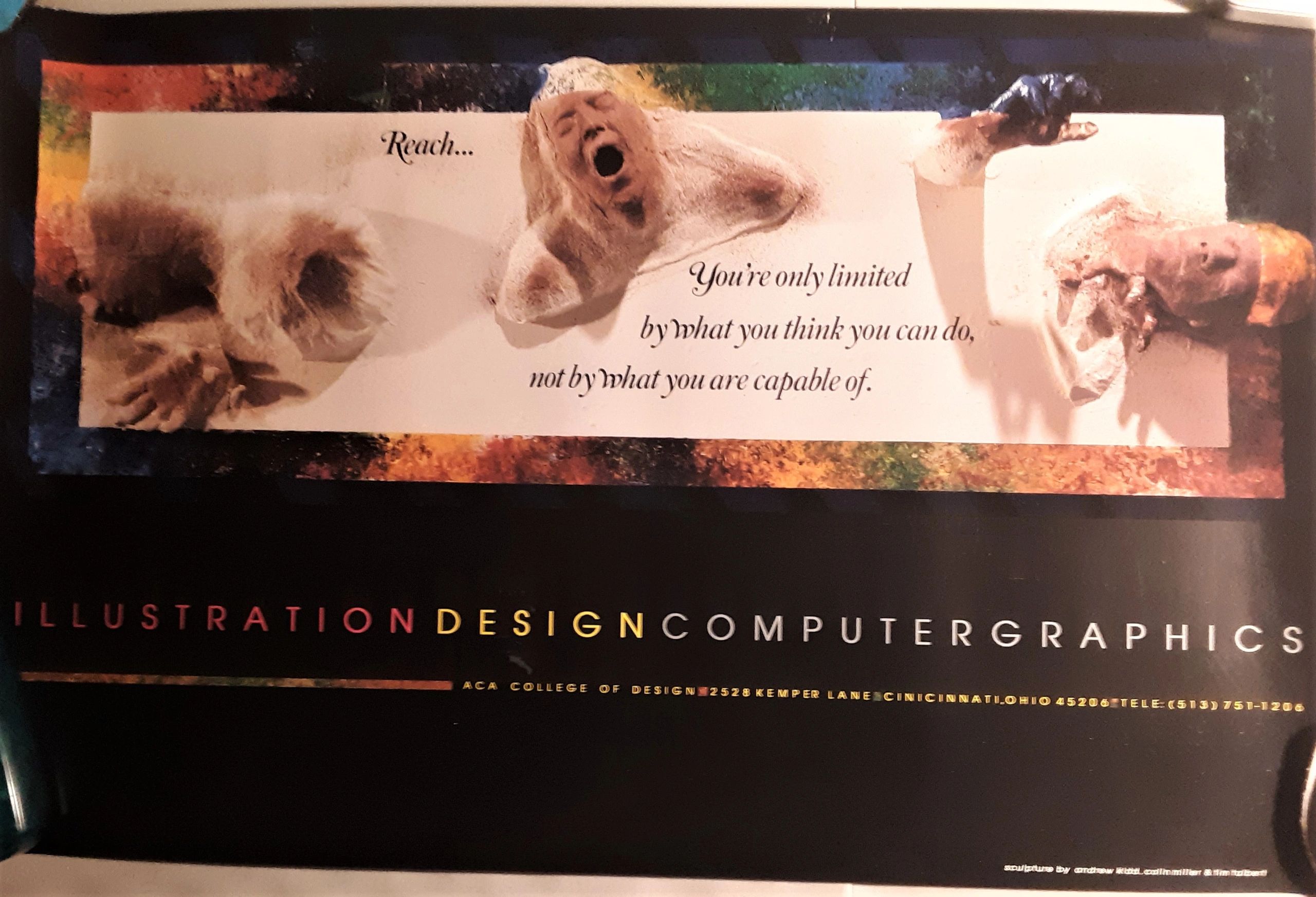
With my interest in Makeup Special Effects, “The Door” was made with Colin Miller and Tim Talbert and was displayed at the ACA open house. After this showing, it was photographed and used as a promotional poster for ACA the following year.
Was an independent design business run by Joseph Roberts. He hired me to help him with the large workflow of ad designs and layout responsibilities for the Black Business magazine “The Black Pages”.
For the advertisement specs brochure, I brought in my friend Colin Miller to create several illustrations of people such as the Malcolm X portrait and the caduceus symbol of medicine... I brought in a White Artist to work on the Black Pages... let that sink in.
This was an intensive project that took several months. It was printed by All Starr Printing, which I would use for some of my freelance projects later on.
I’ve always enjoyed working on freelance projects, coming up with designs that help to convey a client’s message visually. Projects included local small businesses, independent contractors and performers.
When I was 19 and working with a 26 yr old black independent Graphic Designer, Franklin Mayfield of Mayfield Design, I was learning on the job how to apply vinyl graphics to windows, large vehicles, hand painting letters on school buses and learning how to cut Rubylith film for acetate overlays for ads and custom TeeShirts.
The 1st Batman movie was out and he designed a knockoff "Blackman" shirt which was very popular for a year.
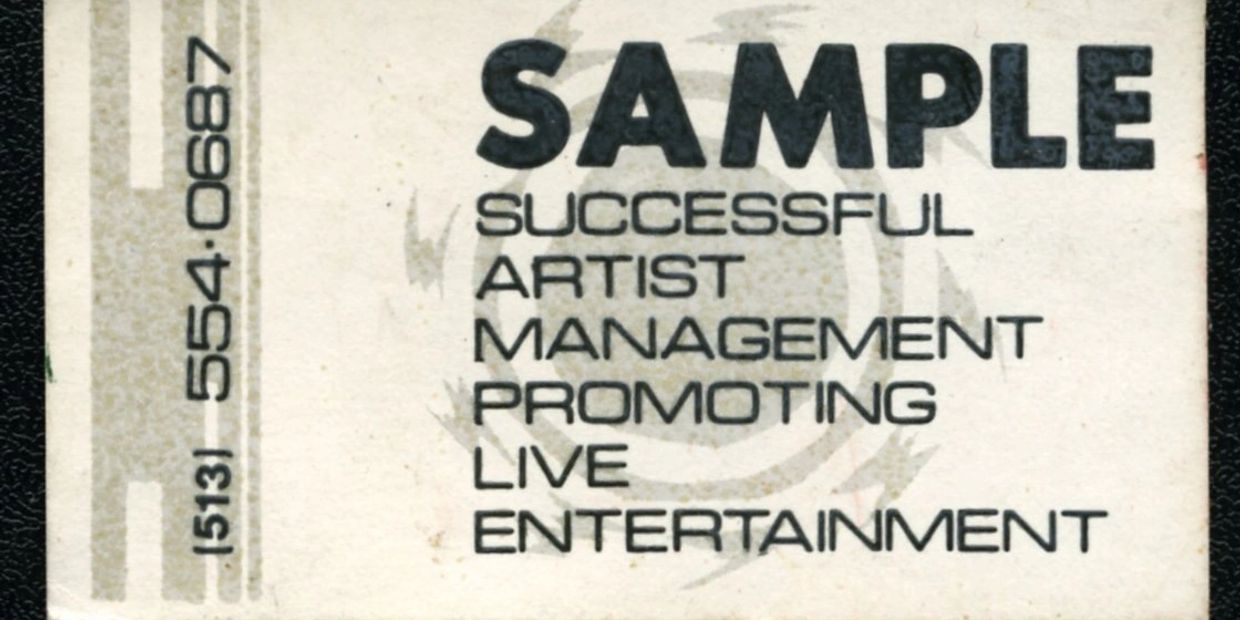
After graduating ACA in 1990 and while working with Mayfield Three Design, my friend Steven Walker and I formed a management group S.A.M.P.L.E. to help promote other new musical performers in our area. I would have the flyers either printed or copied and posted them up on telephone poles around the city.
During our brief union during 1990-1991, we had 6 live events at the clubs The Apple and The Wilderness and the Hirsch Avondale Rec Center. Our 1st event “Freakfest” at the Apple, was a smash hit! My mother and her friend had stopped by and saw that we had the entire parking lot filled and cop cars from 4 different districts had shown up. There was only one small scuffle which was quickly squashed and the party went on until late night.
Steve focused on managing the talent and I developed their logos and themes. We worked with a few different performers and created our custom Teeshirt “I’m Gonna Work It Out” which we had on consignment at the Swifton Commons retailer Artistic Apparel.
The conclusion of this union ended when we joined the rap group MarkMX and I created a tape cover for this before relocating to Lexington, KY for 5 months in 1992. This is where I would meet Angie G., fall in love and move out to NYC later that year…
FREAKFEST at the Apple
JAM at the Wilderness
NYE at the Wilderness
SPRINGFEST at the Apple
The SMOKER at the Apple
BOOMIN' at the Hirsch
I'M GONNA WORK IT OUT!
teeshirt
Groups:
The Minority
Mind Terrorist
My mother started her 2nd business which was computer service based. She asked me to come up with a logo and a brochure for the business. The logo is based off of the shapes on the old, large, black floppy discs. The wording is all hand drawn and the 3 fold, double sided brochure is printed paragraphs pasted up with logo overlays at 40% exposure.
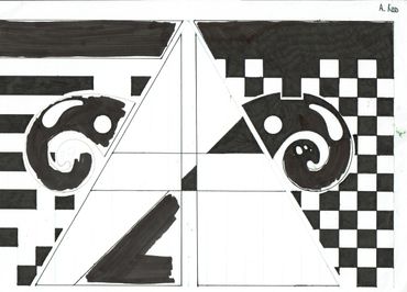
After this project I was really fascinated with logos and the process of designing them. Applying some of the Drafting knowledge I had acquired earlier in High School. I combined grid structures, repetitive shapes, patterns and press type lettering to create more business cards, flyers, logos and posters.
After moving from the Princeton School District to the City School District, I opted to attend Woodward High instead of School of Creative and Performing Arts (SCPA). I thought the SCPA would be too distracting and not enough focus on practical job skills. I had almost failed the 9th grade going into college prep medicine courses at Princeton. After a serious and long thought, I decided to focus on my “God given talents", Drawing and find a respectable trade to learn.
At the time I had attended Woodward, they had an award winning Drafting Trade program for Junior and Senior year students. Since I was a 10th grader, I had to wait another year and took a drafting class in the meantime.
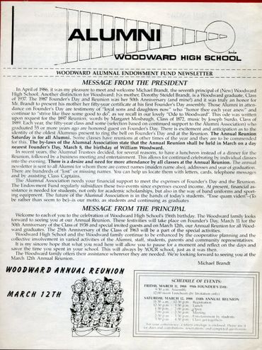
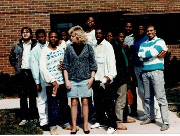
During my senior year my grades rose to the point that I was inducted into the Honor Society, designed the masthead for the Teachers Alumni newsletter and I became more confident in myself. I had started to play drums, bass, guitar, keyboards (which would resurface 8 years later) and even ran for prom king, but lost.
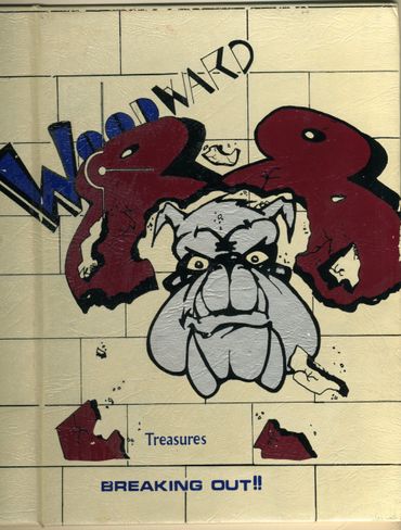
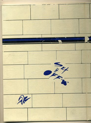
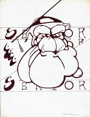
My English teacher, Mrs. Miller had asked me if I wanted to work on the upcoming 1988 yearbook. I took this as a sign to do something more creatively.
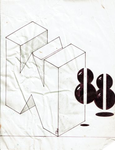
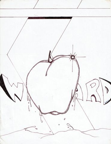
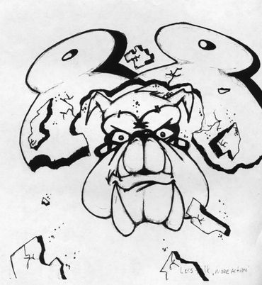
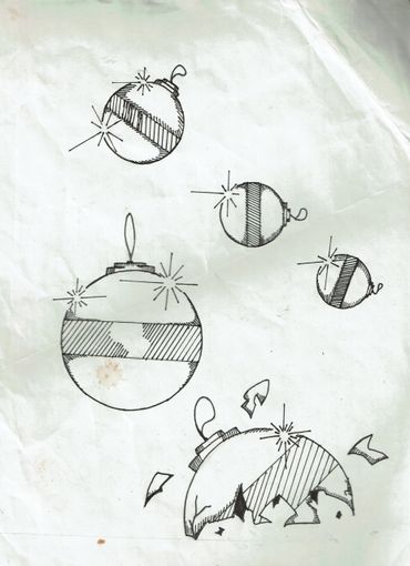
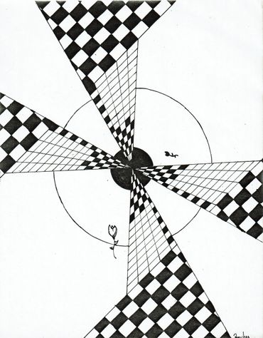
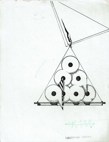
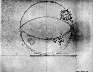
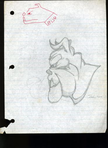
At first I had assembled the sports section then I became the editor creating all of the interior sections and the cover pages. Animals were not my strong suit back then and the bulldog is roughly based off of the old Tom & Jerry cartoon bulldog. The section page illustrations were inspired by my introduction to Surrealism and Salvador Dali mixed with the structured shapes of Drafting.



Copyright © 2026 drewkidd / Andrew W. Kidd III - All Rights Reserved.